Handling Data - Pie Charts
Pie charts are another method of displaying data from a frequency table. They are circles divided into segments which show a fraction of the total and are good for representing proportions.
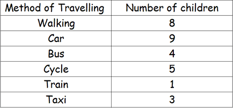
Lets look at an example : A survey of the class to investigate how they travelled to school determined the following results. This data was incorporated into a frequency table
and then used to draw a pie chart.
Notice the key, which explains what each segment relates to.
The size of each segment shows the frequency / number of children, but it is unclear as to how many children are represented by each segment. We would need to look at the frequency table to determine the exact numbers.
The chart could be modified to include the data or displayed as a percentage.
 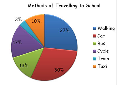
Ask your child to interpret the information displayed. - What is the most popular method? ... What is the least popular? ... How many children in the survey? - How many more children go by car than take the train? - How many children use public transport?
This Interactive Pie Chart Generator from Maths is Fun, will allow your child to experiment with creating Pie Charts from various data.
|