Handling Data - Bar Charts
Bar charts are another method of displaying data from a frequency table. They are the next step on from pictograms, but instead of using symbols that relate to the information, the data is represented in the form of bars, the value of which can be read from the frequency information shown at the side of the chart,
along the vertical axis. The height of the bar shows the amount.
Lets create a bar chart from the pictogram/frequency table about Smarties.
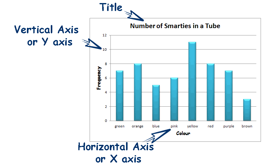
A bar chart must have a title to explain what the chart is about.
It also must have a horizontal axis, or 'X, Axis which goes along the bottom of the chart and must also be labelled to explain what information is displayed, in this case the different colours.
It must also have a vertical axis, or 'Y' axis along the left side of the chart, also labelled to explain what data is represented, in this case the frequency or amount of smarties.
To remember which axis is which, think about 'X' being 'a cross' and running 'across' the chart.
To read the data from the chart, look at the top of the bar and read the number that lines up with the vertical axis. ie. The 'pink' bar lines up with 6 on the vertical axis, so there are 6 pink smarties - yellow lines up with 11, so there are 11 yellow smarties.
By convention, bar charts are normally drawn with the frequency shown on the Y axis, however sometimes you may find a bar chart drawn with the frequency shown on the X axis, like this:

In this case, the lengths of the bars, indicates the frequency / number of smarties.
|