Line Graphs are another method of displaying data.
This type of graph is usually used to display information that is connected.
They are often used to show how values change with time.
Line graphs use points that are connected by lines which allows values to be
estimated along a line drawn through the points.
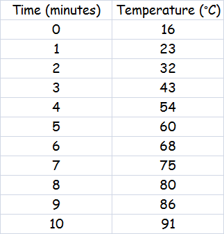
An example of this might be a graph to show how the temperature of water
increases with time when it is heated.
The water was heated for 10 minutes and the temperature of the water was measured at intervals of 1 minute. The data was recorded in a frequency table.
This information was then plotted onto a graph by accurately placing a small cross at the point where the values of time and temperature intersect.
A line was then drawn between all the plotted points - notice that the line is not straight, it is a smooth curve which follows the trend of the data and also extends beyond the last recorded point.
The X axis, horizontal axis (remember that X is a cross, across), is normally used to display values that are constant, in this case time.
The Y axis, vertical axis, is used to show the values that are changing, in this case the temperature of the water.
Don't forget that a graph should have a title and the axes should be labelled correctly - including the units of measurement, minutes and °C. Marks are always awarded for titles, labels and units of measurement, so it essential to get this right.
Ask questions to ensure that your child can interpret the data.
What was the temperature of the water after 2, 3, 5, 7 and 9 minutes?
What was the temperature of the water after 1½, 4½, 6½, and 8½ minutes? (this is one benefit of using a line graph - measurements were not taken at these times, but by drawing a vertical line up from the time required and then drawing a horizontal line across from the point that it intersects the line of the graph, we can read off the temperature at that time. At 4½ minutes the temperature was 56°C - at 9½ minutes it was 88°C.
What time will the water boil, reach 100°C?
The experiment did not run long enough for the water to boil, but by extending the
line of the graph we can make an estimate of the time that the water would take to
boil by drawing a horizontal line across from 100°C on the Y axis until it intersects
the line of the graph and then drawing a vertical line down to the X axis
and reading off the time - 13½ minutes.
This activity from BBC Bitesize will allow your child to practice interpreting data with Frequency Tables, Tally Charts, Pictograms, Bar Charts, Pie Charts and Line Graphs.